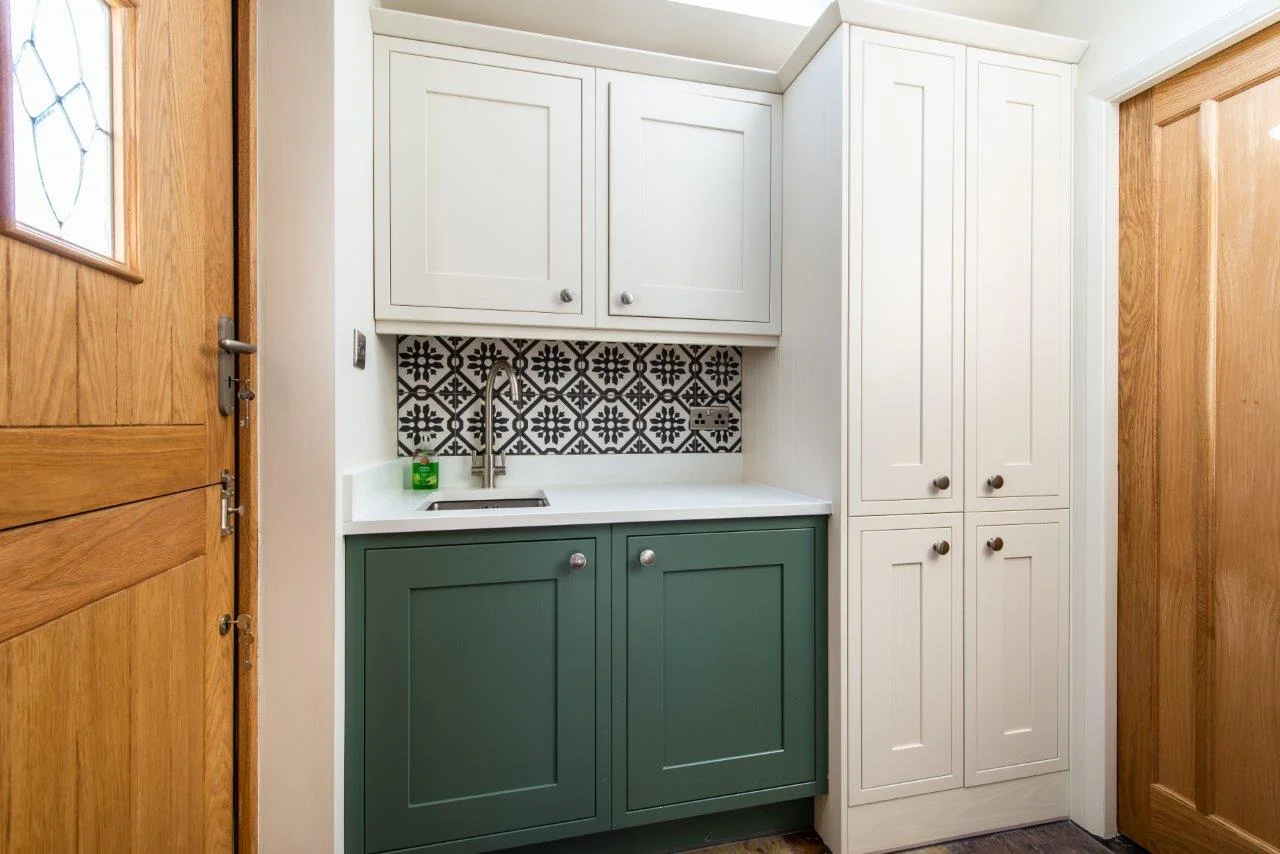
Our Bespoke Utility Rooms
We have recently had a surge of customers requesting utility rooms along with their bespoke kitchens. And why not? Utility rooms can be a real treat, helping with additional storage space, and hiding away laundry machines.

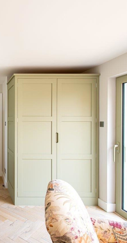
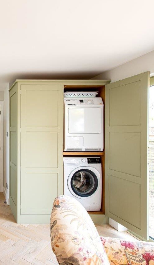
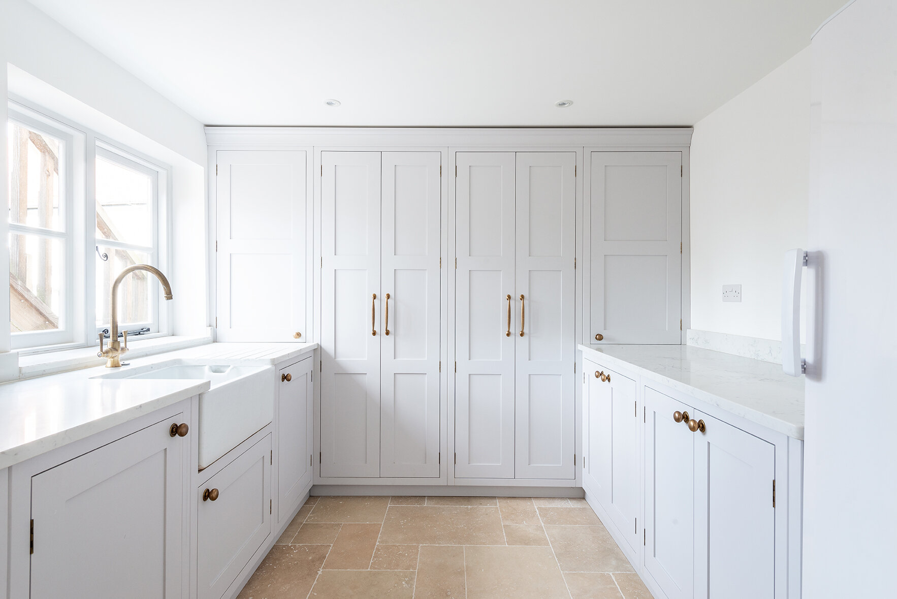
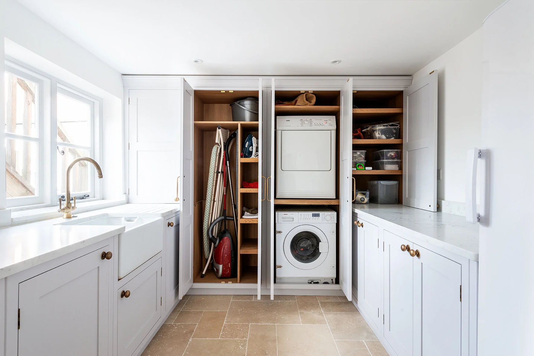
Whether they’re adjacent to your kitchen, disguised as kitchen units or a totally separate room, utility rooms are becoming more and more popular due to their practicality and more aesthetically pleasing appearance. If yours has an exterior door, it could easily double as a boot room for storing wellies and shoes after jumping in all of those muddy puddles.

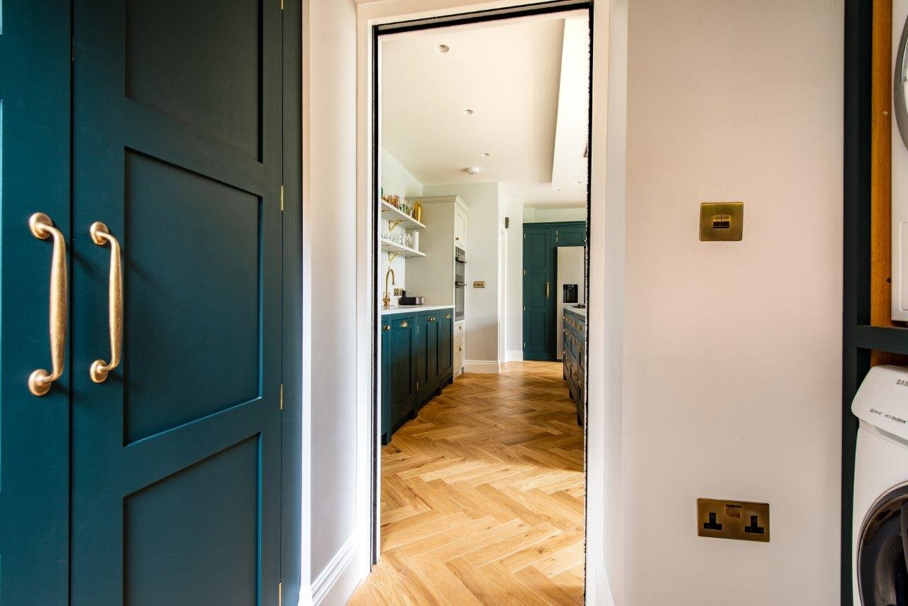
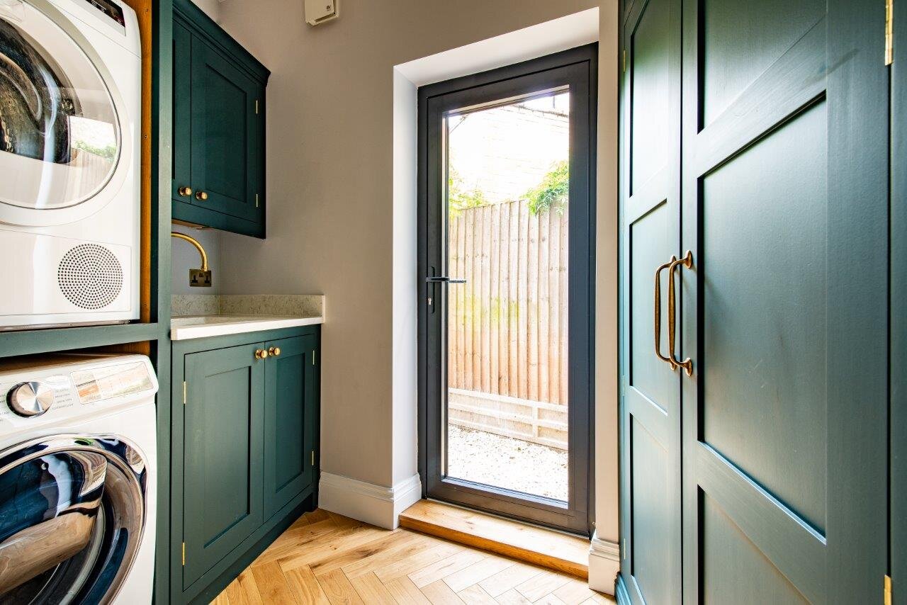
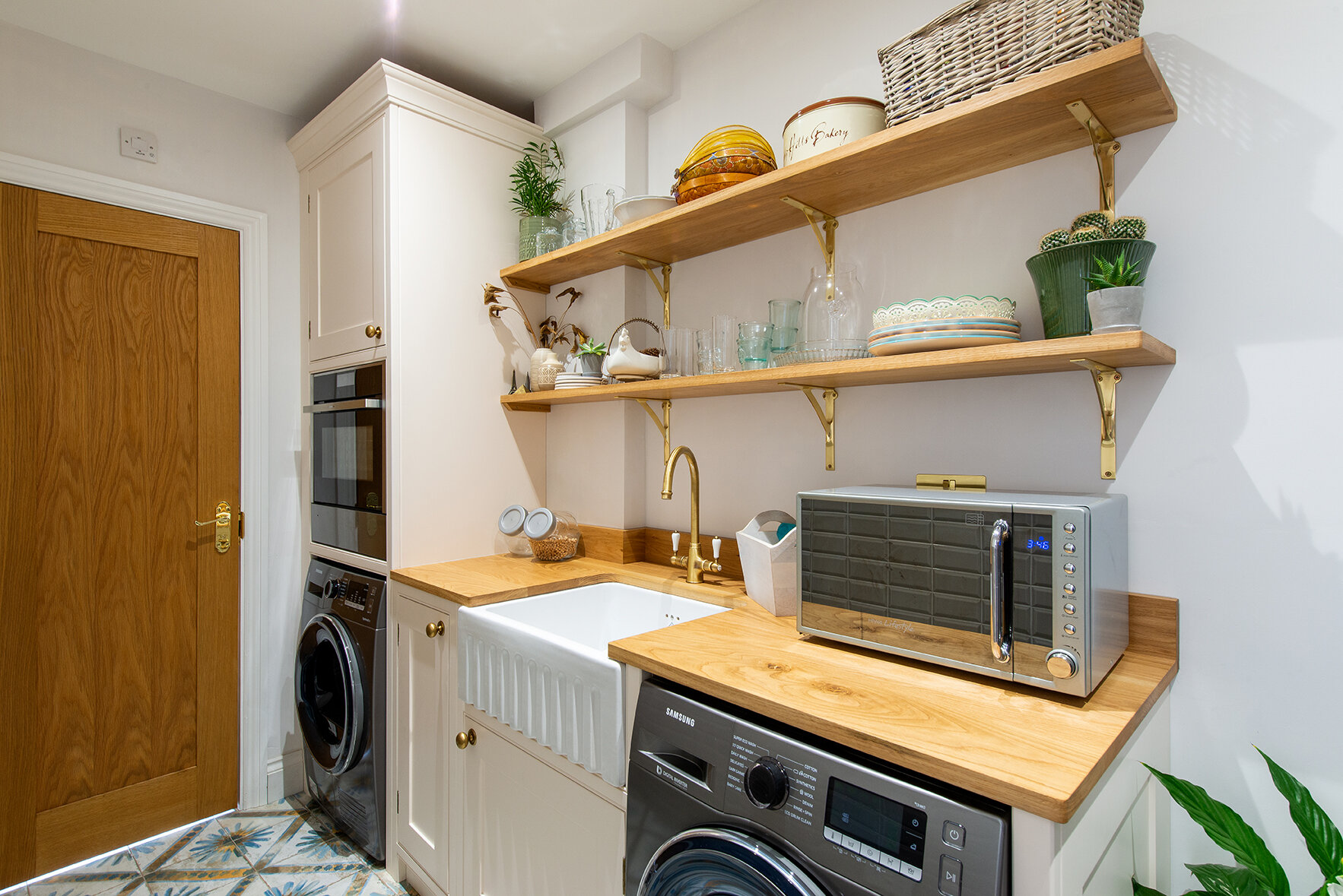
A sink in a utility room can be really beneficial. From hand-washing delicate items, pre-soaking and treating stains before throwing clothes in the washing machine. They also make excellent (small-ish) dog bathtubs!
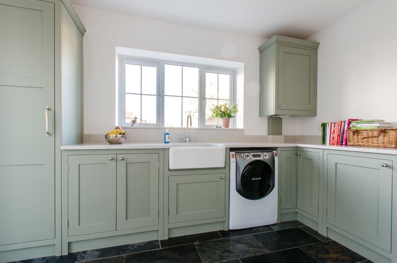

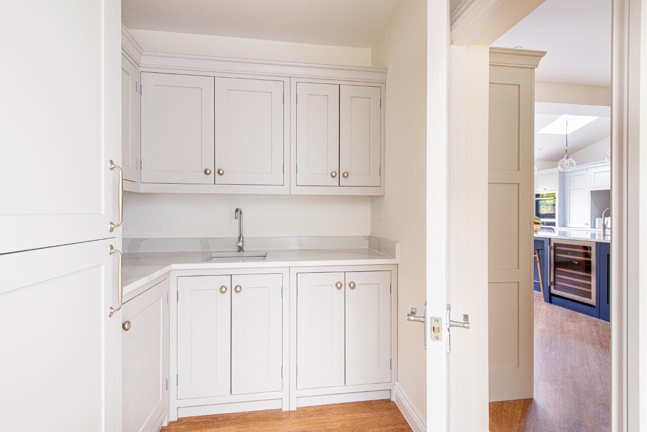

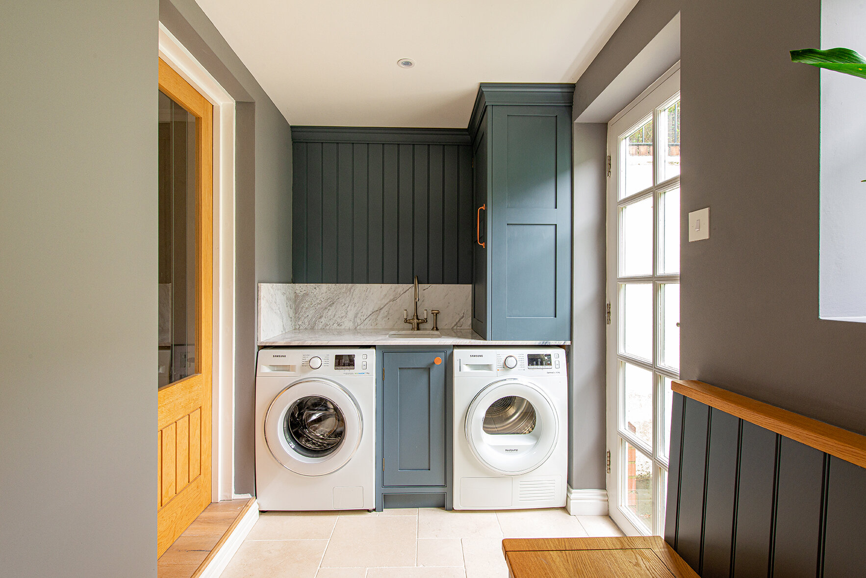
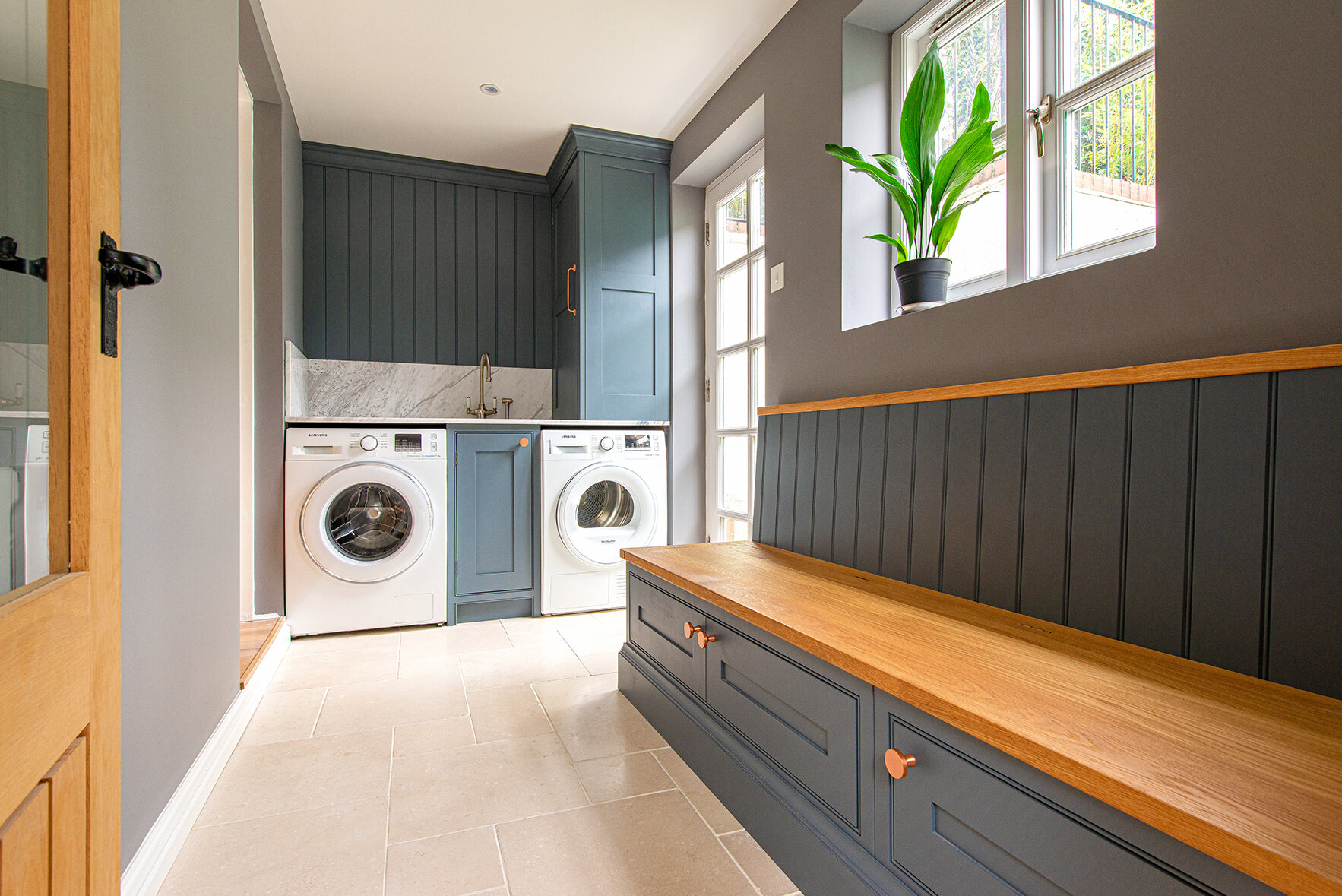
If you’re painting your utility room a contrasting colour to your kitchen, a nice way to create continuity is by using the same handles on your cabinetry. This will also make your space feel more luxurious,


Glass Units: Plain, Rippled or Georgian Wire
Glass units are quite often considered during the Design Consultation rather than planned beforehand. Most people don’t necessarily think about them when initially imagining their new dream kitchen. However, in our experience implementing glass units into the rest of your cabinetry can have beautiful results that will leave you wondering how you never considered them before!
Here are the types of glass units we supply and some examples of them in recently completed kitchens:
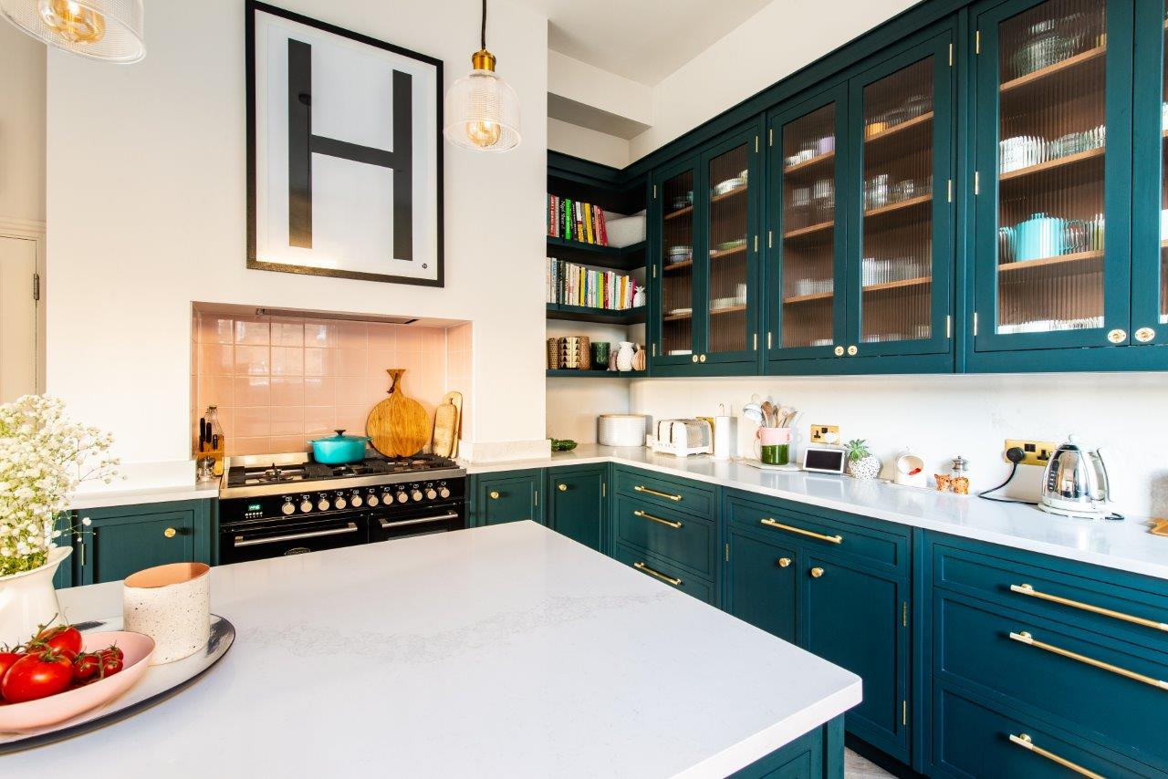
Plain: Straight forward and effortlessly beautiful. Like any glass units, plain glass will open up your space but will also display and showcase the items in your cupboard. Consider having spotlights installed into the top of your unit for a glow of light going through. Plain are most often used in traditional style kitchens.

Rippled: This type of glass unit adds an Art Deco or chic element to every kitchen and will add an additional texture to your space. This rippled effect glass won’t hide your items but it will obscure the view.
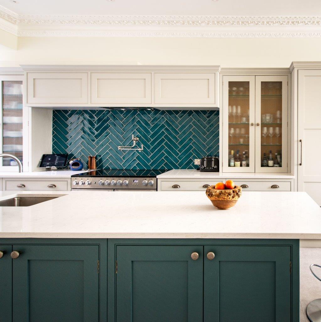
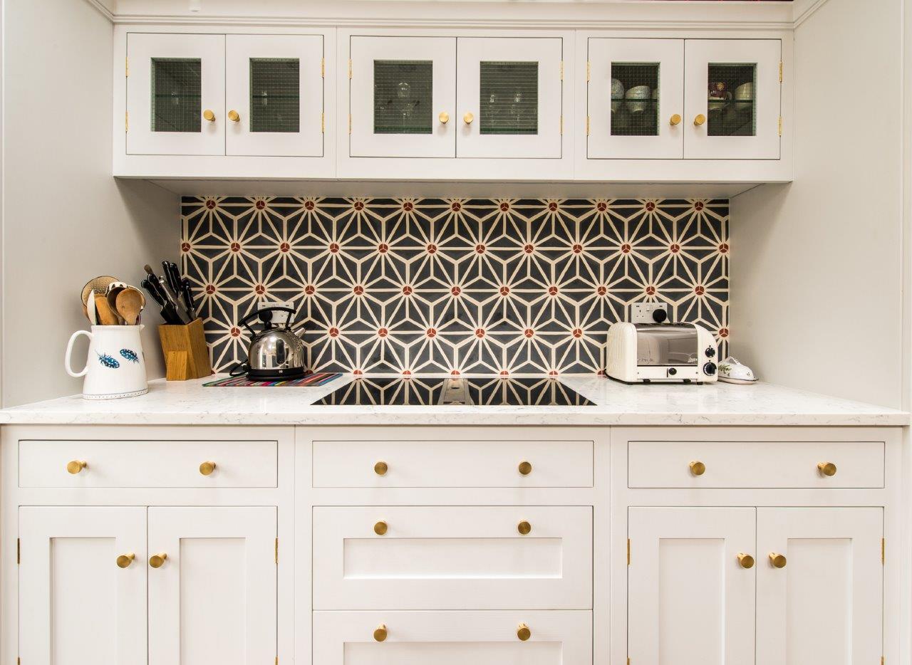
Georgian Wire: A little bit different, a little bit cool. Georgian Wire glass will elevate your kitchen with its interesting design while still showing off your items. It adds an industrial element to every kitchen.

Design Mistakes and How to Avoid Them
When designing your dream kitchen, you’ll have a lot of fun, choosing colours and tiles, that double door pantry you’ve wanted for ages, seeing the perspectives and it all coming to life!
But there are a few important things to think about when considering the actual design and flow of your kitchen. We have compiled a list of some commonly made kitchen design mistakes and how to avoid them.

Too many units and no variation
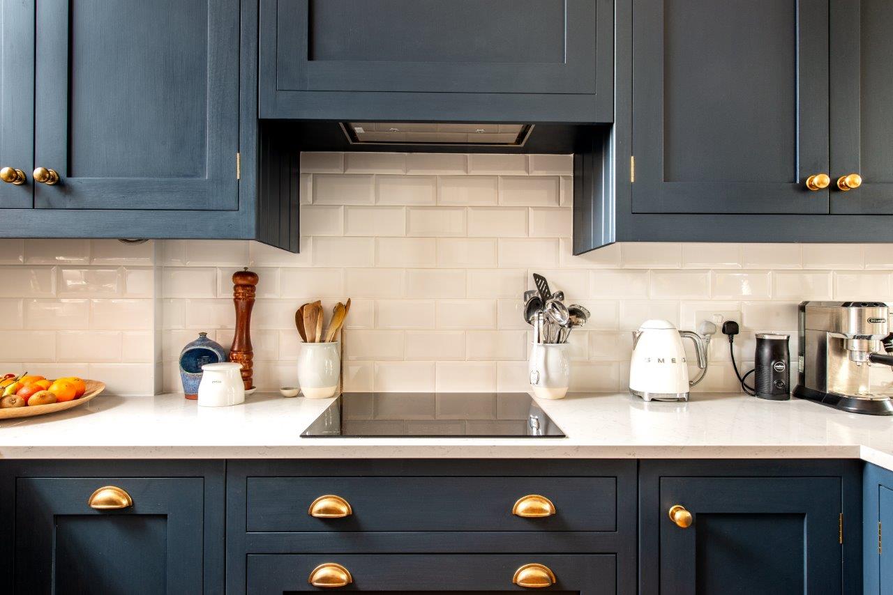
A sure-fire way to make your kitchen feel smaller and claustrophobic is by having too many wall units; especially if you have a smaller kitchen. If you don’t have a larger space or taller ceilings, focus more on the bottom units and make sure to add a variety as too many cupboards can sometimes look busy. Mix up cupboards and drawers depending on your lifestyle and storage preference, it’ll make a world of a difference to the over all look of your kitchen.
2. Aesthetics over functionality
One of the worst things you can do when designing your new kitchen, is focusing solely on what it will look like rather than taking into consideration your lifestyle and functionality of the space. Of course you want your kitchen to be as beautiful as you’ve dreamt it! But you will come to resent it once you start to find problems in how you work in it. Consider things like work flow, is the sink a little too far away from your bin? Is there enough counter space and storage? Have I chosen a material that will stain easy and does this suit my lifestyle? Is there enough ventilation? Do you tend to splash about at the sink, is a wooden worktop realistic? These may seem more boring than choosing colours and handles but are very important in the design process.
3. Skirting board under the sink unit.
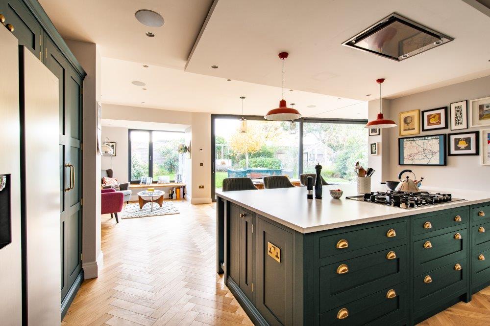
Something we advise against is skirting boards under the kitchen sink units. Simply because, you will end up kicking them. Keep the skirting around areas like larders, free standing units and taller units.
4. Not enough lighting or all spotlights
Lighting is so important when it comes to any space and variation is key! Too many or all spotlights may be a little too bright and solely under unit light strips or lamps won’t provide you with enough light to cook safely in. A few different lighting choices to keep things interesting and suitable for different times of day and moods!

5. Tall units in corners
Tall units are stunning, there’s no question about it. What we advise when it comes to these beautiful giants, is to avoid putting them in corners. The reason for this is simply because they will create a dark corner in your kitchen and close the space up.

6. Not injecting your own personality into the design/solely going with trends or other peoples taste.
Don’t make big decisions based on fleeting trends and other peoples opinions! The best way to go about designing your kitchen is by following your gut feeling with colours, handles etc. You can always ask one of us for some help if you’re unsure, but don’t let other people make the decisions for you. If you don’t love it, it’s not for you!
7. Something needs to be over the island.
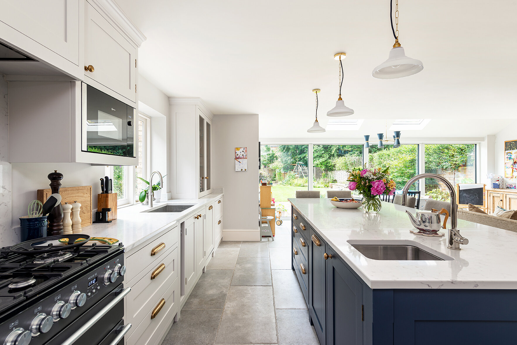
When it comes to kitchen islands and peninsulas, they generally work best with something hanging over them. You could go for a selection of pendant lights (three always looks best) or if you have lower ceilings, maybe an overhead shelf to display cookbooks, plants and styling pieces.

A Guide to Mood Boarding & Colour Combinations
We know renovating or redecorating a space can seem like a daunting task to take on. With endless options of paint colours, decorative tiles and handles in all shapes and finishes; it’s a lot to take in. This is why mood-boarding can be a great way to narrow down your options and help you visualise your space easier. A little visual aid never hurt anyone after all!

Mood Boarding Basics
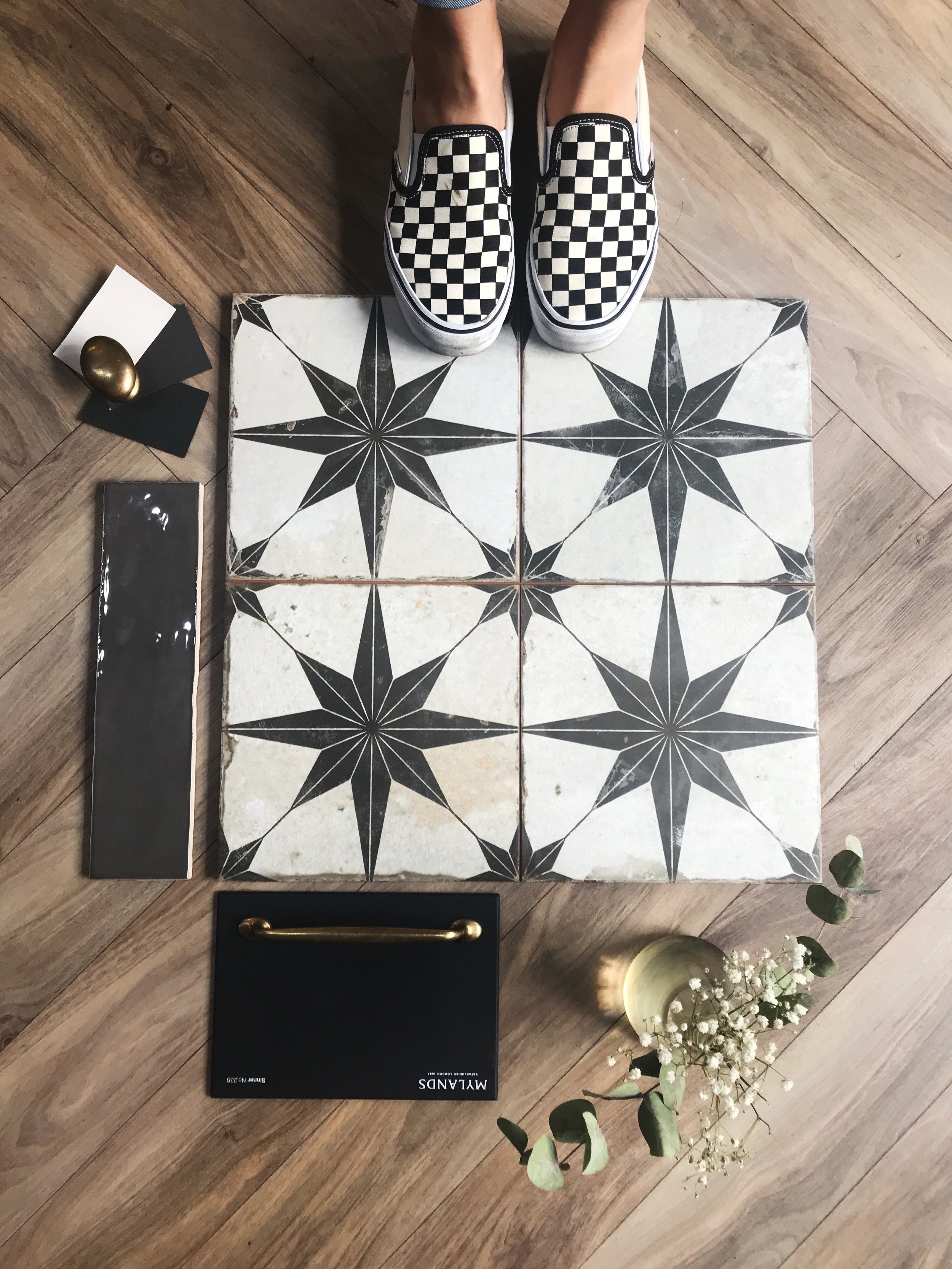
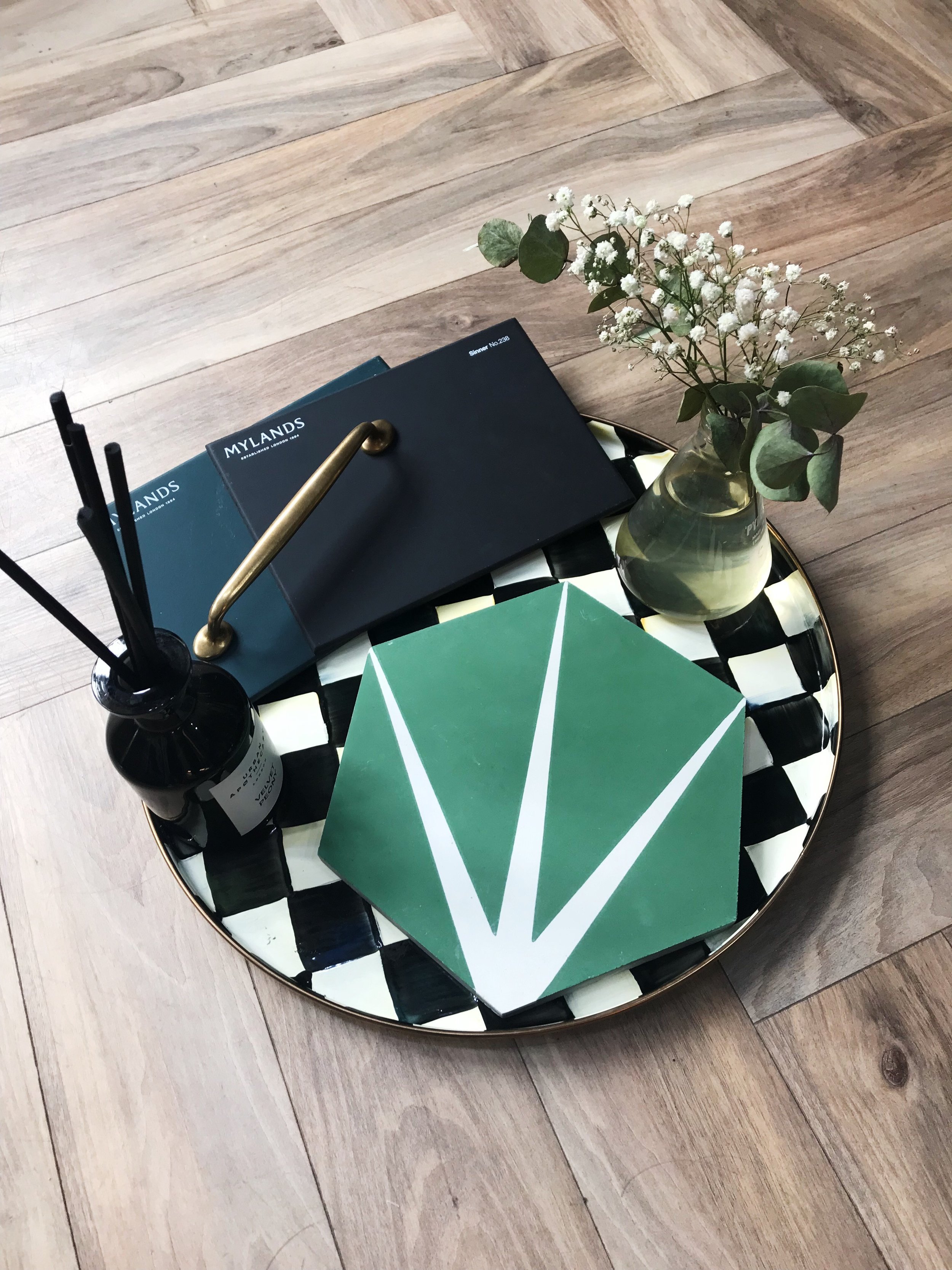
There a few different ways of creating a mood board. Traditionally, a mood board consists of a physical board like a push pin board of foam, where images and textiles can be attached. However nowadays it’s more common to use apps like Pinterest, or photo editing software to create collages full of your inspiration images. More and more clients are using Instagram to help organise their thoughts. You may want to keep things even simpler, by ordering samples of things like paint, handles, tiles and textiles and laying them out in different arrangements. This way you can have a very clear understanding of what works with your scheme.


Pinterest to The Rescue
If Pinterest is already something you’re familiar with, there’s no better place to start your mood boarding journey. Start by collecting images of completed spaces you find attractive or that speak to you and evoke the feeling you want your own space to feel like. Then go on to Pinning images of more specific things like taps, patterned tiles, fabrics and paint swatches. Pinterest in particular is a great app to use, as not only can you save inspirational images to your Board, but you can also add images directly from company websites. For example if you have your heart set on that Perrin & Rowe tap, you can Pin that exact tap.
Start by collecting images that speak to you or evoke the feeling you’re after in a space. You can find these anywhere from magazines, company websites, Pinterest or even taking photos yourself when visiting shops or different spaces. Restaurants, galleries and other commercial interiors often serve as great inspiration. Once you have a general idea of what you want in your space, try arranging images around one larger image of a completed space with a similar vibe or similar elements to what you’re after. This can be used as a visual aid througout the project and help you to understand what does and doesn’t work for you and your space.

“What defines whether a colour is stimulating or soothing is not the colour, it’s the intensity. A strong, bright colour will stimulate, and a colour with low saturation will soothe”
Choosing your Colour Combinations

Colour combinations are often a part of design that people have the most trouble with. How to choose different colours and make sure they live harmoniously and above all, are pleasing to the eye. Artists and designers often use the Colour Wheel method. By looking at the wheel, working out which colours, hues and tones work best with each other.
You may well have chosen a colour you absolutely love and have settled it! The best thing to always remember is that in design, it’s all about balance and juxtaposition.
Some examples:
If you’re using a bold and vibrant colour, on your main or island cabinetry, introduce a softer, lighter version of that colour respectively.
If you’re going neutral and inoffensive all the way, why not add a bold and intricate patterned tile to avoid looking clinical.
As with anything, there are exceptions to the “rules” if you may. If it looks and feels right to you go with your instinct. If you’re still unsure, you can always call us and ask for our advice. We love helping you out and making sure you’re as happy as possible with the end product!
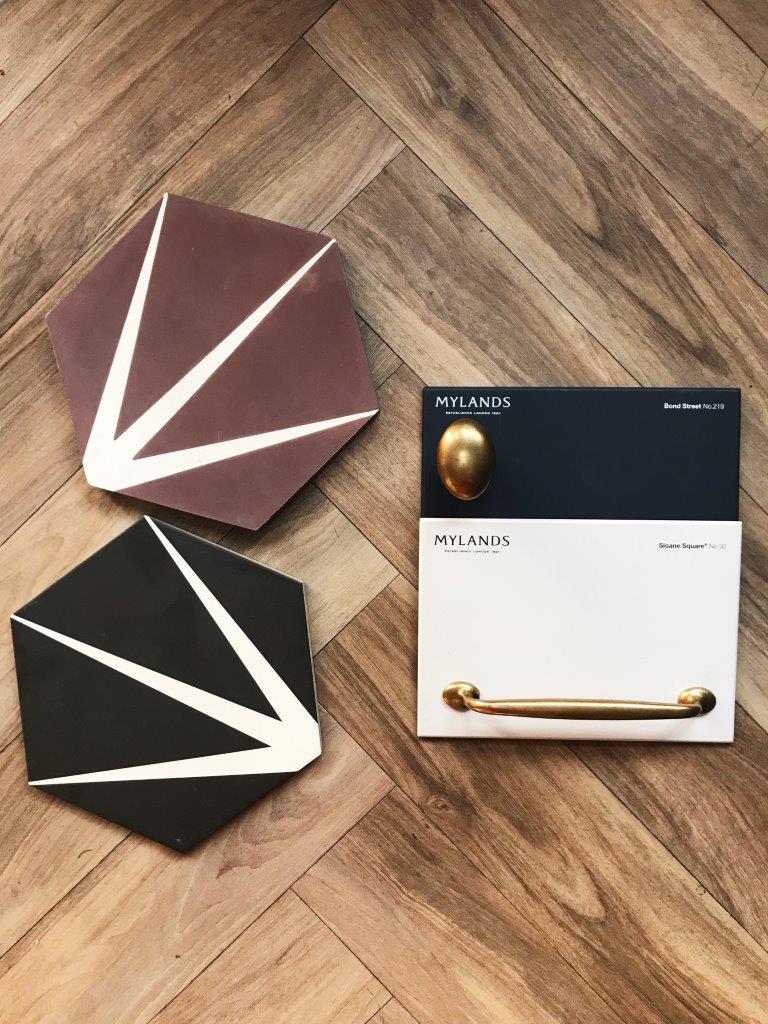

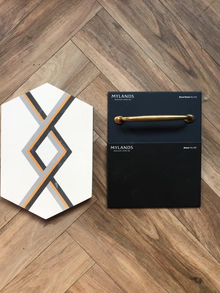
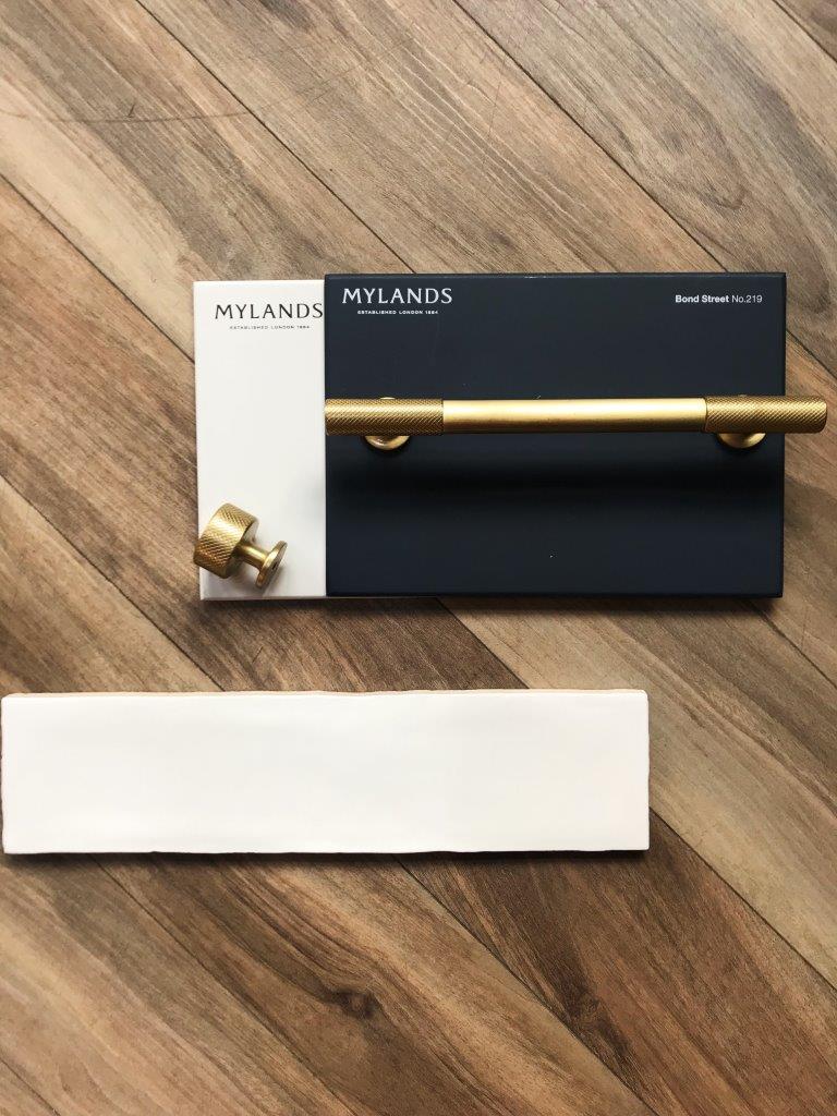
One very important thing to remember is, you can follow all the “rules” and trendy colour combinations, but the most crucial part of any design is that you love it. Imagine yourself waking up each morning and making yourself a cup of coffee (or tea) in that kitchen and feeling happy! So get on that Pinterest board, or whack out a scrapbook and have fun!
More Blogs From Herringbone…